The fragility and volatility of healthcare systems were sharply exposed by the pandemic that swept the entire world several years ago. It was not only related to the emergence of a new disease doctors didn’t have a clue how to treat. Lack of agility, insufficient resource distribution, inadequate hospitals and doctors’ workload, and difficult access to critical info played their roles, too. All these problems fell upon the world as an avalanche, instantaneously and unexpectedly.
Obviously, these issues had been brewing for a long time, the pandemic just revealed how acute they were in reality. Many of these challenges could have been mitigated by a reliable healthtech solution, providing easy and quick access to critical information presented in a concise way, which is easily digestible and simple to analyze.
Our previous article was dedicated to predictive analytics in healthcare, where we discussed how it helps to move the industry forward and which underwater rocks may occur on the way. In the current blog post, we’d like to touch upon a quite related topic — data presentation and its meaning for the medical world.
Continue reading to learn about the importance of data visualization in healthcare and how to build a reliable and well-balanced dashboard that would help medical facilities streamline their daily operations and execute first-class patient care.
Data Visualization in Healthcare in Action
To some, the way you present data may seem to be something unserious and unworthy of such close attention. However, let’s consider some healthcare data visualization examples that will showcase the fallacy of such a way of thinking.
Swift Decision-Making

Information reflecting bed occupancy rates in city clinics and hospital locations to assess the distance from the fire and the number of medical staff on shifts — all these metrics are critical for decision-making. But when every second counts, will you have time to open numerous Excel reports on each clinic in the city? The answer lies on the surface — no.
To make a swift and data-based decision, the critical information must be quickly accessible, and this can be resolved by visualization.
Timely Error-Detection

Sure thing, considering each result separately we have no opportunity to see the overall picture and suspect that something went wrong. Visualization will help to detect such errors as improper data preparation and processing, wrong algorithm selection, or medical equipment malfunctions.
Easy Trend-Tracking and Pattern-Recognition
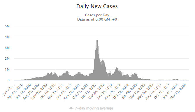
Source: Worldometer
Visualization can help us to monitor patterns and forecast trends using historical and real-time data. With information presented in such graphs, doctors are empowered to track the spread of diseases, predict seasonal outbreaks, efficiently monitor patient conditions, and take timely measures in case of aggravation.
Enhanced Patient Care

Discover more about the Consumerization of Healthcare
Using visualizations, doctors have critical information on a patient right before their eyes, bypassing the need to open numerous laboratory and examination results in the system separately. As a result, it saves both medics’ and patients’ time. Also, when prescribing treatments, medical staff can monitor their effectiveness and promptly adjust if a patient’s vitals get worse.
KPIs Tracking and Resources Allocation
Clinical data visualization can help medical facilities resolve these issues. Having a comprehensive view of staff workload, hospital admission rate, and inventory availability empowers clinics to improve staff performance. They can also adjust medications and reagents procurement plans and create their budget more thoughtfully.
Learn more about Hospital Management Systems
Tools for Dashboard Building: What the Choice Depends On
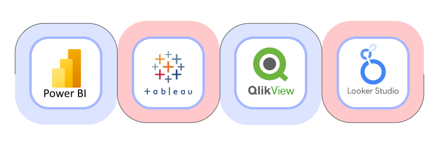
In the previous section, we considered several healthcare data visualization examples and use cases that can be addressed with the right approach. But bear in mind that high-quality health data visualization is impossible without specific tools.
Of course, the choice depends on our aims and a range of factors: software capabilities, integrations, and limitations. Below, let’s consider some of the most popular healthcare data visualization tools that can be used for the resolution of related tasks.
|
Visualization Tool
|
Brief Overview
|
|---|---|
| Power BI / Microsoft Fabric | A powerful Microsoft-owned platform, with a wide range of libraries, perfect for customized visualizations, data engineering, and analysis. |
| Tableau | A counterpart of Power BI, ideal for data exploration and visualizing intricate datasets. |
| QlikView | An intuitive tool great for designing precise reports in graphs and charts. |
| Looker Studio | Google-owned platform integrated with Google Analytics and Google Cloud. |
Which ones are most suitable if we speak about data visualization in healthcare? Here, we need to consider capabilities of robust data analysis, carrying out some ETL activities, ability to handle massive datasets, customizability, and possibilities to build predictions. And also, the type of medical facility or organization for which we need a health data visualization solution.
For example, the first three tools listed above have quite an expanded pool of capabilities; they are highly customizable and suitable for, let’s say, predictive analytics. This may be relevant for hospitals, clinics, ambulances, and laboratory networks. It’s also applicable to health insurance companies and multidisciplinary private and public medical centers with large patient flow.
What if it’s a single dental office, a small private specialized medical center, or a tiny laboratory taking tests on a single indicator? Not sure that such advanced tools will be of critical need.
Looker Studio, a convenient and intuitive visualization platform, for example, doesn’t support predictive analytics and is not suitable for building highly customizable dashboards. But are these features really critical for such small medical facilities? The question is quite rhetorical.
Healthcare Dashboard UX: Minor Issue or Pain in the Back?
It appears that a healthcare dashboard should be functional and effectively present the information we intend to view. However, what about usability, design concept, and other UX-related aspects? Are they crucial when it comes to medical data visualization, or they are not worth much attention? Let’s try to find out.
Learn about Why Having a UX Strategy Is Important
Number of Metrics and Ease of Perception Ratio

Remember our very first example with an ambulance dispatcher who needs to distribute injured people among clinics? The dispatcher on duty must have crucial info readily available, minimizing the need for additional effort to locate necessary information when every second is vital.
Dashboard Layout

For example, we have a dashboard containing information on a city hospital. The key metrics that are crucial for us should be visible immediately — such as the number of available and occupied beds, admissions or discharges per day, and average doctor and patient ratio.
Of course, this is all high-level information that doesn’t reflect the full picture. We can obtain more detailed information with the drill-down principle by clicking on the metrics. Therefore, we can access data for different departments of the clinic, statistics, graphs, forecasts for the future, and much more. The point here is that the dashboard must be concise and intuitive, with the elements placed in a logical way to bring maximum value.
Read more about Healthcare UI/UX
Dashboard Reactive Behavior: Yes or No?
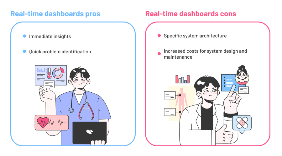
The majority of dashboards are updated manually or automatically several times a day. If we speak about healthcare organizations working with statistics or making forecasts on epidemic waves, it’s completely justified that such facilities are not in critical need of the info relevant to the current moment.
Another matter is if we speak about hospitals and clinics. In these cases, the dashboard’s reactive behavior is a real must. For example, there is a patient in intensive care in a critical condition. There are multiple sensors transmitting vital indicators to the system: heartbeat rate, saturation, body temperature, blood pressure, and more. Real-time updates and configured alerts help medical staff more carefully track patient’s condition and take immediate measures in case of negative dynamics.
Sounds quite simple, but nobody has canceled implementation complexities and increased related costs. The issue is that to display information in real time, the software must have a specific architecture able to receive data continuously. Especially, if you have a lot of data that will be recorded every 10-30 seconds and loaded to storage, the costs for system design and its maintenance may be quite high.
Hence, it’s better to think carefully, whether a real-time healthcare dashboard is something you can’t do without. If you have a continuous data flow and your healthcare system is high-load and requires real-time updates for critical decision-making — investing in such a dashboard is indeed worthwhile in terms of costs and efforts.
Discover the Types of Data Analysis for Better Decision-Making
Machine Learning for Health Data Visualization
Yes, we can use machine learning for data analytics and visualization in healthcare to enrich our dataset. There are many contemporary business intelligence solutions that leverage ML. For example, Power BI’s feature, AutoML, allows even those who are not proficient in machine learning to train, validate, and invoke ML models directly in the tool.
Let’s imagine, we have a table with patients’ comments on their treatment satisfaction. With ML, we can insert an additional column with numbers reflecting the positivity rate of this or that comment from 0 to 10. AutoML possesses a set of pre-trained models that we can use to read the reviews and evaluate patients’ satisfaction with provided healthcare services. And note, there’s no need to write even a single line of code!
Explore the Benefits of Low-Code Development
Concluding Lines
Health data visualization is instrumental in tackling the ongoing challenges that arise within the industry. By having critical info readily accessible, you can swiftly make data-driven decisions, promptly identify discrepancies and errors in healthcare data, and deliver exceptional patient care.
In the ideal world, dashboards are intended to simplify the lives of their users. Sometimes, though, they also make it more complicated. In the majority of cases, it happens because of incorrect visualization tools selection, poor and inconsistent design, and, of course, absence of balance between the number of desirable metrics and concise presentation manner.
Velvetech’s team is well-versed in data engineering and is proficient in healthcare software development. Drop us a line, and our seasoned engineers will be happy to assist you in every step of creating a top-notch visualization for your healthcare facility, so you can use your data with maximum efficiency!
About the author